
Torden Brands
Cutting through the chaos with a bold, controlled campaign system.
Torden needed a sharper presence in a crowded category full of visual noise. I helped shape a high-contrast campaign look built to stand out fast and scale cleanly across formats.
Art Direction / OOH / Print / Retail Collateral
Strategy
Instead of adding more noise, we leaned into contrast.
Heavy black. Bright white. Controlled color. Clean hierarchy.
The goal was simple: create a visual system bold enough to stop people and disciplined enough to stay consistent across every touchpoint.
Challenge
In a category where everyone was shouting, Torden needed a brand presence that felt more confident, more distinct, and more controlled.
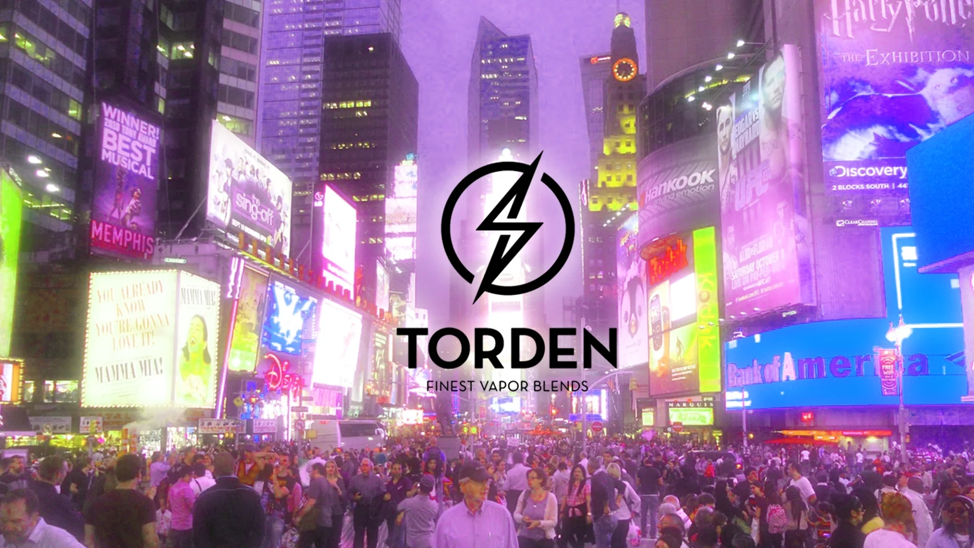
The work had to hit hard in Times Square, then hold together across print and retail without losing its edge..
Approach
The creative leaned on sharp contrast, minimal clutter, and focused composition to maximize visibility in high-distraction environments.
Less decoration. More control.
That restraint became the point.
Solution
I helped develop a stark, high-impact campaign language that gave Torden a more recognizable and credible presence across channels.
That system extended across:
Times Square billboards
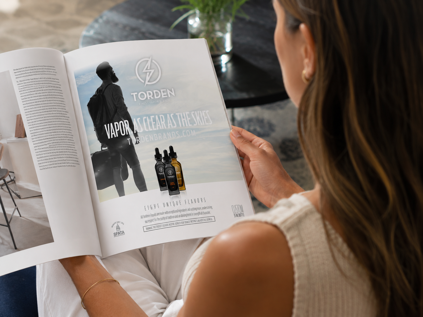
print advertising
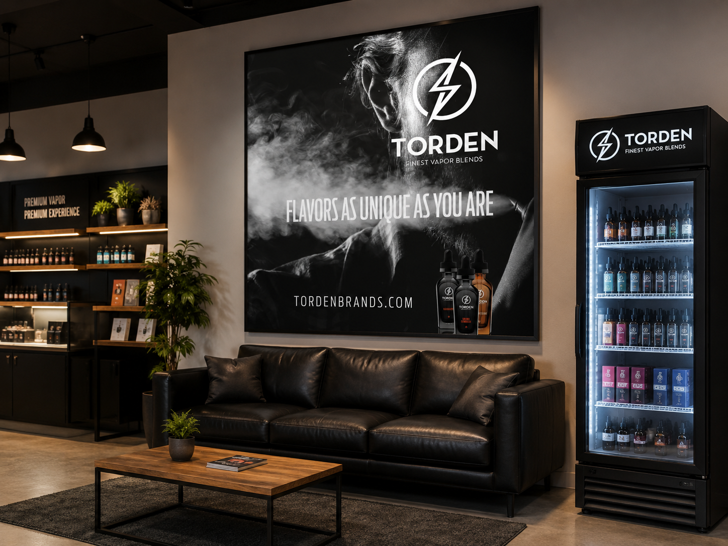
retail collateral
branded merchandise
Every piece was designed to feel connected, not copied.
Outcome
The campaign gave Torden a stronger, more cohesive brand presence across major public-facing placements and supporting materials. The work also earned a Telly Award, adding outside recognition to a campaign built for visibility and impact.
My Role
As Art Director, I helped shape the visual direction and apply that system across multiple brand and campaign touchpoints.